The Amazing History Of London's Most Enduring Logo
FOR OVER A CENTURY, THE LONDON UNDERGROUND ROUNDEL HAS GOTTEN INTO THE DNA OF SOME OF THE WORLD'S TOP DESIGNERS. A NEW BOOK EXPLORES HOW.
It is hard to imagine a simpler symbol than the one that brands every London bus, subway, and station, the London Underground Roundel. Although little more than a dark blue bar placed across two red-rimmed semi-circles, the Roundel has evolved from humble signage meant to tell passengers where to get off the train to an emblem that represents not just a metropolis but its people as well. The Roundel's incredible journey is being freshly explored in Logo for London, a beautiful, lavishly illustrated new book. Published by Laurence King, Logo for London tracks the Roundel's cultural, artistic, and social importance over the last hundred years as it became the world's most well-known transportation symbol.
"Like many millions of other people commuting through London, I saw this symbol at every station countless times per day," says Logo for Londonauthor David Lawrence. A design historian stationed at the University at Kingston University, Lawrence began to wonder how such an abstract symbol as the London Underground Roundel became an important part of the life of the city. "I rather foolishly made myself the man responsible for trying to interpret it for as wide an audience as possible." After 15 years spent poring through city archives, papers, and ephemera for any mention of the Roundel, Lawrence's book is the definitive history of an important cultural icon.
While simple, the genius of the Roundel's design is that it is a perfectly abstract symbol for the concept of a subway itself. It implies what it stands for. The Roundel's semicircles form opposing platforms seen on either side of the intersecting line, an underground railroad that both divides and unites the symbol as a whole into a destination. "It's entrancing in its simplicity and power," says Lawrence. "The Roundel is neither picture nor typography. The Roundel is always instantly recognizable as itself in whatever context it is placed while simultaneously communicating the idea of transportation, urban cool, and serving as a visual metonym for London itself."
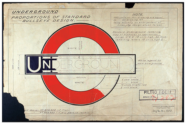
The London Roundel traces its origins back to 1906, when the Underground Electric Railways Company of London, shortened to the Underground Group, decided they needed a way to tell passengers riding on the subways where they were within the bowels of the city's vast underground labyrinth of stations. What was wanted was signage that was easy to read and had a distinctive enough design that it would stand out even amongst the busy visual background noise of subway billboards and advertisements.
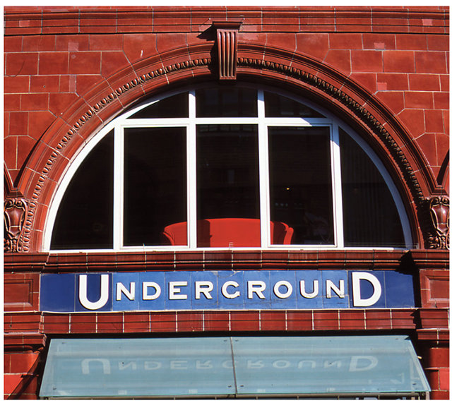
The Underground Group looked for inspiration no farther than France, deciding to steal its distinctive blue subway signage. White boards with five-foot-long blue nameplates were placed a railway-carriage length apart on every London Underground platform, with the name of each station spelled out in six-inch-tall letters. The Roundel itself was created because there was a perceived need to set this signage apart by providing contrast to the lettering. After a number of tests, a round red disc was placed beneath the signs' blue bars. By 1912 or 1913, the circle evolved, with two white semi-circles placed inside the red disc. The Roundel was born, and remains virtually unchanged today.
It's true that there have been occasional attempts to abandon it. In 1933, the Underground Group was renamed to be London Passenger Transport Board. Although "Underground" had previously looked satisfying written across the Roundel's blue bar, the London Passenger Transport Board's name was just too unwieldy. It couldn't quite squeeze in. And attempts to ditch the Roundel to accommodate the Underground's longer new name proved wildly unpopular. When it was clear that the symbol itself could not be abandoned, the abbreviation L.P.T.B. was crammed into the Roundel's topmost semi-circles, and a thick line was added to the inside of the ring to visually counterbalance the extra weight of the letters. Even this solution, though, didn't last. In what Lawrence refers to as a "unique and interesting example of an organization changing its outward facing name just to suit an iconic symbol," the L.P.T.B. eventually renamed itself to London Transport.
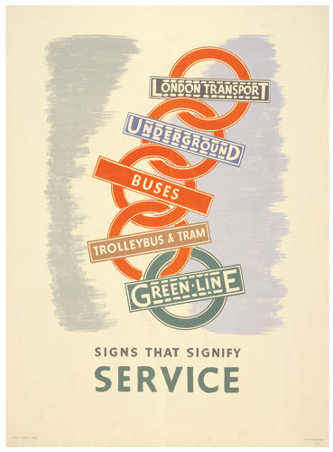
What makes the London Underground Roundel so unique amongst logos? "It is one very few symbols in the world that represents a city, a place, a transportation network, and an experience of place, all at the same time," Lawrence tells Co.Design. "People associate the Roundel with their time in London, and from that cultural association, it has moved into an entire network of counterculture uses and appropriations." In fact, the Roundel has made the leap from train platforms to fashion labels, record covers, club fliers, beer labels, and more. Even better? The Roundel stays classy and elegant no matter where it goes, with none of the implied hokeyness of similar symbols like, say, the "I (Heart) N.Y." slogan.
To Lawrence, the London Underground Roundel is proof that iconic design needs time to evolve. "You can't create a brand as perfect as this by sitting down with an iPad and trying to create it," he says. "This sort of design is a synthesis of happenstance and determination. If there's any lesson at all to be learned from its design, it is that a brand that highlights simplicity, abstraction, and careful use of color can pay dividends."
It is a lesson Lawrence believes has influenced some the 20th century's greatest design minds, such as Raymond Lowey and Jonathan Ive, who would have seen the Roundel every day growing up in London. "Whether they know it or not, the London Underground Roundel has gotten into their DNA," says Lawrence. And they are not alone, for that is the Roundel's great achievement as a symbol: It is a badge that every Londoner feels identifies them as citizens of the greatest metropolis in the world.
FastCompany
The Amazing History Of London's Most Enduring Logo
![The Amazing History Of London's Most Enduring Logo]() Reviewed by Unknown
on
Sunday, October 06, 2013
Rating:
Reviewed by Unknown
on
Sunday, October 06, 2013
Rating:


No comments: